Saturday, February 27, 2010

Happy Birthday Dear!

It's a beautiful sunny morning here in Ohio, and we are celebrating my husband's birthday today. Last night we enjoyed a fun family dinner at a Buffalo Wings place and had a great time! Today I'm sharing this card for you that we all signed for him. I made this on Friday during the SCS Virtual Stamp Night challenges. For this challenge they posted the Official Olympic Sweater as our inspiration... I didn't know there was such a thing.

The colors, pattern, texture and even the use of the deer were all intended to mimic the sweater. The funny thing is when I was all done with this card I was sitting and just gazing at it trying to decide if it needed anything else when my husband, unprompted and from across the room, says "did you just make that? It looks really cool from over here." That's when I decided it must be perfect as it is. LOL!

My main deer is from Wildlife Reserve, while the deer head repeated at the top is from Nature Silhouettes and the Happy Birthday repeated across the bottom is the most current, from Vintage Labels Sale-a-Bration set. I thought the Lattice Die would be a neat pattern to add, though it is tougher than I thought to piece it together. I used the pieces that fall out for the row at the top. Middle gray piece is embossed with the embossing folder (can't remember what it's called.)

Thanks for stopping by for a visit! Stop back tomorrow!
~Kristin
Inukshuk Inspired!

This weekend is a VSN at Splitcoast. Wondering what that is? It stands for Virtual Stamp Night. It's a monthly event, I think, where hourly challenges are posted and guests are welcome to participate in as many or as few as they choose. I normally don't do much stamping on the weekends but last night was an exception. I forgot to mention that all challenges are Olympic themed so the Inukshuk symbol is the sketch for our first challenge.

I thought it would be tough at first but it didn't take long to figure something out. In fact, I used ALL scraps sitting on my desk! There is a time limit of 45 minutes for every card so I timed myself and this one took me 27 minutes once I started.
For the multicolored packages I stamped the image from Happy Moments (free with a $50 order right now!) three times, once on each color, then cut them out. The package was also stamped on the white paper so the ribbon shows up.

I used the Big Shot and Perfect Polka Dot Impressions folder on the Melon Mambo pieces at the bottom (stamped image first of course!) The two buttons have a little sliver of Melon Mambo paper to look like thread.

The Kiwi Kiss piece was on my desk- leftover from an old Simply Scrappin' Kit that I can't recall the name of.

Thanks for stopping by and checking it out! Maybe you'll go play along?!
~Kristin
SUO Supplies
Stamps: Happy Moments, Well Scripted
Colors: So Saffron, Kiwi Kiss (retired), Melon Mambo, Whisper White
Accessories: Melon Mambo dotted grosgrain ribbon, Playground Designer buttons, Big Shot, Perfect Polka Dot Textured Impressions folder

Thursday, February 25, 2010

Look Familiar?

If this looks familiar you don't have to scroll down very far to find out why. This is a copy of the card in the previous post but in shades of gray. Monochromatic can look so sharp, and really aid in the clean & simple feel. I left out the flowers on this one, for even more simplicity. A very easy-peasy card. Cutting out the butterfly is the most time-consuming part, and that really isn't that bad! See previous post for some tips!


Thanks for visiting!

~Kristin


SUO Supplies

Stamps: God's Beauty

Paper: Going Gray, Night & Day DSP, Whisper White

Accessories: White taffeta ribbon, scallop trim border punch

Wednesday, February 24, 2010

Beauty is God's handwriting

I must admit, I messed up! I made this card for today's Diva Coffee Break Designs challenge... then realized (too late) that I used entirely the wrong colors. This must have been another color challenge I saw somewhere else. The DCBD challenge for today is to use Pale Plum, Certainly Celery and Rich Razzleberry. I inadvertently used Pale Plum, Soft Suede and Perfect Plum. Oops!


Fortunately I made a card the other day (second one down) with these colors so that is why what you see here and what you see linked to the DCBD blog are two differently cards! Now you know.

Anyway, for this one I was using a sketch from this card. The stamp set is an old hostess set that I'd never mounted. I've always liked it, but had put it up on my top shelf and forgot all about it. The Soft Suede patterned paper is actually from the Thoroughly Modern Designer Series Paper pack- did I ever mention that this pack of paper went missing for about 2 months? I found it tucked away with my scrapbook stuff. I swear I am fairly organized, but somehow things still manage to sneak away from me for a while. I guess the good news is that I do find almost everything eventually (except those two scoring blades and that one butterfly stamp).

The flowers have a dot of Crystal Effects in the center, and the butterfly has a hint of Pale Plum coloring done with the aquapainter and ink from the lid.

Stampin' Tips: (I've seen this feature a few other blogs and think it is very informative and helpful so I'll try to add this for your convenience, from time to time.)
  • Wondering how to free-hand cut out an image neatly? The key is using the right scissors. In fact, you should have one scissor for cutting ribbon, one for rubber and one for paper! SU's Paper Snips are amazing- they are tiny and very sharp- perfect for those little details. Also, be sure to hold the scissors in place and move only the paper you are cutting. One more thing, I try to leave a thin border of paper around what I am cutting- getting too close is more difficult. Practice makes perfect- don't be afraid!
  • Add dimension! Variation of dimension on a card is a way to go from nice to WOW! Use Stampin' Dimensionals to raise a layer, and Crystal Effects to add a bit of shine, even added texture with some embossing or crimping makes a big difference without added expense!
That's about it! Thanks for visiting me today! So why don't you try out this color challenge then upload to the Diva blog- heck, you might even be selected as our next Featured Stamper!
~Kristin

SUO Supplies
Stamps: God's Handwriting
Colors: Pale Plum Perfect Plum, Soft Suede, Very Vanilla
Accessories: Crystal Effects, Paper Snips, Scallop Trim punch, Very Vanilla taffeta ribbon

Tuesday, February 23, 2010

Looking Forward to Spring!

I think that will be a recurring theme for the forseeable future- looking forward to spring! I went on a two mile walk yesterday and thoroughly enjoyed being outside without feeling frozen. Of course I had on my snowpants, winter coat, neck warmer, hat and ski gloves, but I wasn't frozen! The only thing missing was the sunshine.

Yesterday I had a chance to play along with the Featured Stamper challenge on SCS. This is a challenge I used to join quite often... not sure what happened. I guess my life changed and my Sunday stamping got pushed off until Mondays.

Anyway, the FS for this week is Jovialjudi. I chose this card of hers to use for inspiration. I kept her layout, including the idea of torn DSP for the only layer. I changed the paper, which changed the colors and I used different stamps. Instead of the gems I used two small grommets at the top right and I added some black satin ribbon from the Occasions Mini.

Thanks for stopping by! Tomorrow I'll be back with the Diva challenge for the week (a great color challenge) so be sure to come on back!
~Kristin

SUO Supplies
Colors: White, Black, Real Red, Cameo Coral
Stamps: Flight of the Butterfly
Accessories: Small black grommets, Black Satin Ribbon

Monday, February 22, 2010

Time to say goodbye

It's hard to believe my stint on the CAS Design Team for the last three months is over! But it's been a great experience- full of fun! I think my style is evolving more and more towards the clean and simple, and through this DT I've realized just how versatile that style can be. No boundaries other than your imagination!

Without further ado, here are my final official Clean & Simple cards as a member of the design team, but don't worry I'll always be a participant of this wonderful weekly challenge!

The final challenge for the CAS DT has always been "Makeovers". To redo a card of your own from your reign on the team. Well I chose this card because it is so versatile and I just loved it- and how appropriate that it was my VERY FIRST card on the DT! I knew I could redo this same design in a variety of ways for a number of occasions and they could all be unique. For this first one I made a simple thank you using the Tart & Tangy set that hasn't seen ink from me in ages! Also used some retired DSP designed to coordinate with this set (but I can't seem to find the name of it- sorry!). I changed the scalloped edge to the new Scallop Trim punch from the Occasions Mini catalog.

For my second design I decided on a Birthday card using Cottage Wall DSP and the Boho Blossoms punch for some simple grass and flowers. The simple sentiment is from Happy Moments, a current Sale-a-Bration set that can be earned for FREE with a $50 order.

And finally, my favorite of the bunch. I just adore the Beautiful Wings butterfly embosslit that embosses and cuts at the same time! The beautiful textured paper used on this card is the retired Specialty DSP called Parisian Breeze. I gotta say it is so nice working with those Specialty papers by SU! The card base on this one is an old In Color called Baha Breeze, the lighter blue at the bottom is also an old In Color, Soft Sky. And believe it or not, the ribbon is from yet another set of In Colors called Blue Bayou! I just love how I can continue using these retired colors in new combinations all the time. Sentiment is from Curvy Verses, an old favorite that is still available! Did you notice the lovely little chocolate striped brad? It is CURRENT- yipee! Available in the Occasions Mini Catalog as well.

Here's another view of this card so you can see where I put three of the remaining butterflies that this embosslit cuts. For the trail of the butterfly I simply poked a few holes with the Paper Piercing tools.

So how's that for three new takes on a simple sketch?! I'd love to see what you do if you use this sketch yourself. Let me know if you do- I'd love for you to link your card back to the comments so I can come take a look! If I do any more makeovers I'll be sure to share them with you.

Thanks for visiting me today, and for all your wonderfully sweet comments. They keep me going!

~Kristin

Sunday, February 21, 2010

Cute story and a card

I have a cute story, I think, that I thought I'd share. I don't believe I have mentioned it but I had noticed about 1-2 months ago that I was missing my two favorite embossing folders. The Manhattan Flower and the Elegant Bouquet. At first I didn't really look much because I assumed they'd turn up. Then I started looking harder and harder and couldn't find them anywhere. I was nearly sick worrying that I'd accidentally thrown them away.

Anyway, fast forward to this week during one of the many snow days we had where my kids were cooped up at home. Well on this fine day they were actually playing nicely together and not bickering- so when my DD came to me all official-like saying she was a private detective for her brother (the boss- of course!) and she wondered if I had a case for her I happily played along. I couldn't think of anything that needed investigating so she said "what about those things that are missing?" So I gave her details about the last place I saw them, how long they'd been missing etc which she dutifully recorded in her little hand-held notebook her brother provided her (along with the walky talky she had clipped on her waistband) and off she went.

Well lo and behold, didn't she just find those stinkin' things after about 5 minutes on the case! I kid you not- they were right in the basket I keep next to my Big Shot which I swear I had checked not once but twice while looking for them! WOO HOO! I was so excited that I swore the next card I made would utilize at least one of them. Well, here it is.

So that leads me to this card. I like how it turned out- don't think I've ever embossed a Top Note before. But it isn't an over-the-top WOW for me. Not sure why. I think the colors and use of brads are casual, but the glitter is a bit too much maybe. I kind of wish I would've left it off and maybe just distressed those edges for a softer, warmer look. Maybe next time. I do love the brads though!

So thanks for stopping by and for bearing with my story above!
~Kristin


SUO Supplies
Stamps: Well Scripted
Colors: Barely Banana, Kraft, Chocolate Chip
Accessories: Big Shot, Elegant Bouquet Textured Impressions embossing folder, Barely Banana Brads, Top Not die, wide vanilla organdy ribbon, Dazzling Diamonds

Friday, February 19, 2010

BIG POST!

Trying to make up for my random posts lately. Did I ever mention that my husband was out of town for 5 days last week on a hog hunting trip in Florida? That was my primary excuse for not doing much stamping... that and the incredible amounts of snow we got. Yes, it kept me home but it kept my kiddos home as well and we all know what that means. Less "me" time!
So here's the first card I made. This is a CASE of my own card seen here. I had the supplies out for my downline to make at our meeting on Friday and decided to try it out in these colors instead (Rich Razzleberry, Pale Plum and Very Vanilla). I must admit that I prefer the Soft Suede version for some reason and think it is better as an anniversary card because of the "kissing" birds. However, the texture does show up a bit more in the Pale Plum, wouldn't you say?
Here are the little treats I made for my girls! These were so quick and easy. I made four out of 1 sheet of cardstock. The measurements are 2.75" wide by 8.5" long. Scored at 1", 4.5" and 5". I'm sure I saw a similar idea somewhere on-line, but I have no idea where. If this idea was yours originally feel free to speak up! The top scalloped edge just folds over the front and I added a bit of repositionable adhesive so they could be opened and closed. The candy hearts are in a tiny ziplock plastic bag and stapled inside at the top. The tag is made with the retired "Say it With Scallops" stamp set and the scallop square punch with a small heart punch added on!

This one was also a M&T for my downline meeting Friday and is a CASE of a great card I found on a link from a link from some blog I visit and no kidding, I can't find it again. It was one of those things that I copied right from the screen instead of saving it to my hard drive like normal. Please speak up if this is your design. In the mean time I will continue looking for the original. It was so neat- I know I changed the DSP I used so the colors are different, but pretty much everything else is the same. A very quick and easy card and a great use for the Full Heart punch! I used Razzleberry Lemonade paper here.
ETA: FOUND IT! This is the card I was so inspired by. It is by Nancy Riley who was CASING Bard Mann whose card I don't have a link for. Thanks Nancy and Barb!

Here's another of the M&T's I had ready. I'm not exactly crazy about this card but it was to be a challenge to everyone to come up with a unique card using these same supplies. Unfortunately no one was able to make it to my downline meeting so I didn't get to see what they all would've done with this. For this one I used the Beautiful Wings Embosslit to make the butterflies, and the Fine Flourish single stamp to make the pattern at the right. The sentiment is from the Sale-a-Bration set Whimsical Words. See my link at the right if you're interested in earning this set for FREE! Also on this card are Cottage Wall DSP, Rich Razzleberry dotted grosgrain, and silver brads.

Finally, here is the Valentine I made for my daughter's class this year. I know the colors are pretty hideous. I went through and used my retired paper stash for all 25 of them. I think this is the old Mint Medley and the old version of Regal Rose (can't even remember the old name right now). In a big pile they all looked great, but I forgot to photo them and this was the only one left over. On the back I put a Full Heart punched out and she wrote "Peel Here" on it. They were attached with a repositionable adhesive over the 3/4" hole punched through so the candy could come out.

And if you're wondering, no my son didn't get homemade ones this year. I had the best intentions but found out too late that he needed 35 (for both 4th grades) instead of the 23 I had planned for so I didn't have enough supplies. He was going to get the circular treat cups on his. Turns out he didn't really care- and didn't mind getting store bought Valentines the night before his class party!

So how's that for a makeup post??


Thanks for stopping by!
~Kristin

Wednesday, February 17, 2010

{friend to friend}

Hi y'all! Here's my Diva card for today. We were given a simple sketch to work with and see what could be done. The nice thing about simple sketches is there are so many directions you can go with them- so many opportunities to make it your own!

I'm not sure how these colors happened- they just sort of fell into place from the scraps around my desk. This time I actually had the design somewhat decided before deciding to use this birdcage stamp from the Sale-a-Bration set called Happy Moments and the Two-Step Large Bird punch together.

Not sure how well it shows up but the wing on the bird is textured with the Perfect Polka Dots embossing folder. I used the distressing tool on the edges of the Old Olive piece and dotted the background with Soft Suede polka dots.

Hope you like it and consider playing along with the Diva's challenge this week!
~Kristin
SUO Supplies
Stamps: Happy Moments, Teeny Tiny Wishes, Polka Dot background
Colors: Soft Suede, Old Olive, Melon Mambo, Bermuda Bay, Very Vanilla
Accessories: Distressing tool, Two-Step Bird Punch, Scallop edge punch, Word Window punch, Vanilla Embossing Powder

Sunday, February 14, 2010

CAS54: Wishing for Spring!

Today's CAS challenge on Splitcoast is to consider the theme: Wishing for Spring! Well, that's not too hard this time of year now is it?! We've still got tons and tons of snow laying around and are expecting possibly 6 more inches today I guess. I'm usually wishing for spring around the second day of winter!
This is the first card I made for this challenge today. To me spring is soft colors and beautiful blooming trees! So I used Kraft, So Safron, Certainly Celery with a touch of Cameo Coral. I made the flower with three layers from the Boho Blossom punch pinned together with the Sending Love Chocolate Epoxy brad. I embossed the tree in Vanilla then sponge a bit of Cameo Coral for a hint of spring to come.
I went for an altogether different look for this card. This is the closest stamp I've got to a hyacinth looking flower. The grape hyacinth are the first flower after the crocus to come up at my house. I always look forward to seeing them peek through the snow. This card is entirely Sahara Sand cardstock heavily sponged with Whisper White ink. Hope you like it!
Hope you'll go play along with the CAS challenge- and be sure to try out for the new DT stint that starts in March!
Thanks for visiting!
~Kristin

SUO Supplies:

Card #1:
Stamps: Thoughts & Prayers, Picture This
Colors: Kraft, So Saffron, Certainly Celery, Very Vanilla, Cameo Coral, Chocolate Chip
Accessories: Big Shot, Perfect Polka Dot Textured Impressions folder, Sending Love Chocolate Epoxy brad, Word Window punch, Boho Blossoms Punch, Vanilla EP

Card #2:
Stamps: Pocket Silhouettes, Happy Harmony
Colors: Sahara Sand, Whisper White, Elegant Eggplant
Accessories: Distressing tool, Paper Piercing tools, sponge dauber

Saturday, February 13, 2010

An award and another layout

Sweet and sincere TrishG sent me this blog award back in January and I have finally gotten around to acknowledging it and passing it along!

I'm supposed to list 10 things that make me happy and pass this award on to 5 other great bloggers! I'm not sure I could narrow it down to just 5 bloggers that deserve the "Happy 101" award. I'll have to work on that part!

In the mean time, here are 10 things that make me happy (this is the easy part)...

1. My kiddos and husband (a given, right?!)
2. Tight knit, supportive extended family (I'm talking parents, sister, in laws, cousins, aunts & uncles etc)
3. Sunshine
4. Reading a good book- so good I neglect all else!
5. Feeling of satisfaction when I complete a card or scrapbook page I'm totally pleased with
6. Good friends (on-line pals, my volleyball gals, my Facebook Bunco crazies, Splitcoast sisters, darling Divas, etc.)
7. Right-out-of-the-oven-home-made chocolate chip cookies
8. Warm summer days
9. Doing something nice for someone else- it's amazing how good this feels!
10. The day I get my taxes done. Seriously, nothing quite spells relief from that burden as the day they are SENT! Of course the day that refund is direct deposited isn't too bad either! ;)

OK, so I've had some time to think... here are 5 bloggers that make me happy!

And just what you've been waiting for... a few more scrapbook pages.

Once again, not the greatest pictures, but fond memories just the same. And yes, I realize I'm missing an 'a' in Grandpa! I lost it and need my friend's Cricut to cut another one. Will it end up being missing forever and 10 or 20 years from now I'll wonder why there is no 'a' ??
For this layout I had fun combining some funky colors and papers together. Not sure how it happened but it just did. The orange and yellow patterns are from a retired SU collection- can't remember the name off the top of my head. The cupcake die and flower are also SU- from the Sizzlit set Big Bold Cupcake. I made the purple dots on the right side with a standard old hole punch and individually glued them on! I initially thought the purple on the left side was an SU color but searched and searched and could not come up with a match- hence the purple on the right side being a slightly different shade (retired Eggplant Envy I think). That's the curse of not working with all SU stuff!

Thanks for stopping by today! Have a great weekend!

~Kristin

Friday, February 12, 2010

Out of This World!

You ready for another scrapbook layout? Too bad, I'm showing you one anyway since I might not have anything right now. Not many SU products on these pages, so don't strain yourself looking. As I've mentioned before I've been scrapbooking for years and years longer than being an SU Demo (even thought it's been over 5 years now!!) so I have a big old stash of stuff I try to use when I can. Who likes to be wasteful??
Anyway, this was a trip to Cosi my son's preschool class took (hard to believe he's in 4th grade already- this seems like yesterday almost). I did the title with my friend Nicky's Cricut.

Here's the entire layout. The Stampin' Up! products I used are the My Way arrows punch and the Star Brads as well as the stamp of the rocket ship from Pun Fun and the markers to color it. Also used some Brilliant Blue 12x12 paper for the background on the right.
TFL! Stop back again soon.
~Kristin

Thursday, February 11, 2010

XOXOXOXO

Did anyone else grow up using xoxoxo for Hugs and Kisses in your notes, cards and letters?? It seems to me this was instilled by my grandmother and I actually forgot about it until I got a thank you note from my sister last week that had XOXOXO at the bottom.

Anyway, I missed posting yesterday's Diva Coffee Break Designs challenge card. We've been seriously snowed in (with another 6-8 inches on top of the 12-18 we already had) so my kids and hubby have been home hampering my computer/blog/stamping time. Instead we've made Valentine's, worked on a jigsaw puzzle, went sledding, and watched TV together.

This week's challenge was to use Bravo Burgandy, Pretty in Pink and Soft Suede to make a Valentine! Not too hard, eh?! I used my Movers & Shapers heart die as well as the full heart punch to make the window on this card. Inside I used the heart from Love You Much, stamped in Burgandy then watercolored with Watercolor Crayons and aquapainter then added touches of glitter to the center of the flowers. I also textured the Soft Suede piece with the Perfect Polka Dots Textured Impressions folder. Added some ribbon and the little round sentiment from Love You Much, then stamped the inside sentiment from Teeny Tiny Wishes.

I hope you'll consider playing along with the Diva's challenge this week- go ahead and make an extra Valentine for your honey, or someone else that might be least expecting it then get it in the mail TODAY! Also, be sure to check out THIS POST on the Diva Blog to see the Featured Artists for the last few months, and a blog candy winner!

And ONE MORE THING! Today the call for a new Clean & Simple Design Team on Splitcoast came out! I'd love to have all of you try out! This opportunity is for EVERYONE- so please don't hesistate to go for it!

Thanks for stopping by today!
~Kristin

SUO Supplies
Stamps: Love you Much, Teeny Tiny Wishes
Colors: Pretty in Pink, Soft Suede, Bravo Burgandy, Whisper White
Accessories: Movers & Shapers heart die, Big Shot, 1" circle punch, Bravo Burgandy grosgrain ribbon, Perfect Polka Dots Textured Impressions folder, Full Heart punch, Watercolor Crayons, Aquapainter, glitter

Tuesday, February 9, 2010

Snow Much Fun!

Sorry I've been a little unreliable lately. I've been snowed in with family, getting house stuff done, and scrapbooking some- all of which are keeping me from making cards as much. So, for this post I have a variety of things to show you. A card my 8 year-old daughter made, a scrapbook layout I completed recently and finally some snow pictures. We got approximately 12-18 inches over the weekend (hard to tell exactly how much with the strong winds that piled up major drifts!) and are expecting 8-10 more inches today and tomorrow. We've probably gotten 4 more already today. It is just beautiful!
So here's the card my daughter made. The other night while I was making my CAS card she decided to make something of her own, but worked really hard to not interrupt me since I was out of MOJO and almost out of time (translate that to me low on patience!). She picked the colors and layout, stamps and even cut the butterflies all by herself. The ONLY thing I did was tie the ribbon and give her the correct "sandwhich" for the Big Shot. I'm so proud of her and she was proud of herself!
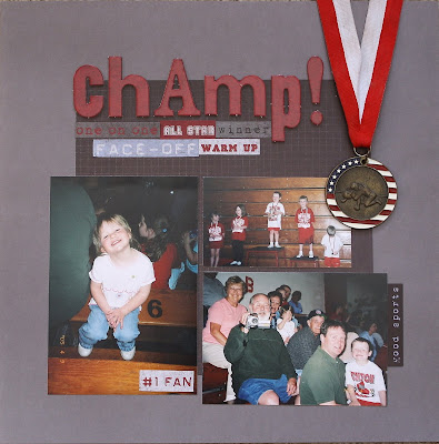
Here is a 12x12 layout I did of my son winning the championship in Biddy Wrestling when he was five. He even said it was OK to put his actual metal on the page (although I was strictly forbidden from cutting the ribbon so it would not add bulk to the album.) This layout, the paper and stickers and chipboard, all came from a kit I bought in scrapbook store at some point. I liked the colors and sports theme, but am disappointed in the quality and the fact that there is only one of each piece of patterned paper. Makes me appreciate SU's Simply Scrappin' Kits even more! Here are closeups of the individual pages.

And finally, a couple of snow pictures from our beautiful Ohio weather! My hubby is a kid himself and always helps the kids make a snowcave in the biggest drift they can find. This time it happend to be right off our back deck. They made it big enough for all four of us to easily lay down inside- complete with a ledge built in next to each person to stow our beverages!
Here was the view out my front door yesterday morning! It was a beautiful drive taking the kids to school- albeit only 4 degrees!
Have a great day! Stay warm and thanks for stopping by!
~Kristin

Monday, February 8, 2010

Retro Candyland... and some beer

What on earth?!? Is that what you thought when you read my title? LOL! Well, today's Clean & Simple challenge over on SCS is to find inspiration on this website Candy Crates Retro Candy Store. Well, I was looking for something really graphic to be inspired by (the candy just wasn't doing it for me) so I went in search of something sweet for the guys where I found this Killians Red beer sign. Perfect! Or so I thought. I love the bold colors and graphic nature of the image but I gotta tell you my first two tries were U-G-L-Y. Even my sweet sweet daughter who approves of everything I do with a resounding "IT'S BEAUTIFUL!" said "yeah, it's not your best mom" or something along those lines to which I totally cracked up!

Anyway, flipped a layer over, then threw it away and started over in my thinking and finally got to this. I'm happy with it. My first idea was way too literal and it wasn't going to be very clean or simply anyway.

After I used half a bottle of reinker to refill my vanilla ink pad I managed to emboss the word Wanted with it, and even stamp some weathered background. The hearts are from the Heart to Heart punch, and "Hugs & Kisses" is from All Holidays (which I get a LOT of use from).

Well, thanks for stopping by and stay tuned. While I was busy working yesterday my DD made her own card that I think is pretty awesome for an 8 year old! I'll post it next after I get them off to school.

~Kristin

Thursday, February 4, 2010

Scrappin' Again!

On to another 12x12 layout I did last weekend. This time I used the Friends & Flowers Simply Scrappin' Kit. It looks much better in real life than in these pictures. Not sure why I struggled so much getting the color, hue and saturation just right. Geez!

Anyway, here are the left and right sides of the layout. None of them are great quality pictures but the kind that I just couldn't leave out. Sweet everyday moments that I cherish and will enjoy looking at in the future. After I worked all weekend on my albums I realized that the stack of pictures I was going through (supposedly chronologically) was actually upside down so everything I did is in reverse order. Which is why the March layout is before the Valentine Signing. Oh well. I could reverse them in the album if I want I guess.

Here's the spread together. Thanks for stopping by today! I enjoy your visits!
~Kristin

Wednesday, February 3, 2010

Diva Day!

That's right, it's Diva Day once again! This week we are bringing you this sketch to work with and it is not hard at all. In fact, pair it with some strips of coordinating DSP like I did and you're nearly done already. This week I wanted a bit of a springy color combo so I used the Tea Party DSP. It actually looks ideal for Easter, I think, with the dots and the ribbon. Reminds me of a dainty/frilly little girly dress that my daughter WILL NOT wear. (Neither would I so who am I to complain??)

The sentiment stamp is from the new stamp set called Well Scripted which is in the Occasions Mini Catalog and available in the new clear mount option. The punched heart was stamped with I {Heart} Hearts also in the Occasions Mini and available in clear mount (remember, that's clear blocks and red rubber).


The Pretty in Pink taffeta ribbon and the Tea Party DSP are both available in the regular SU catalog.


Thanks for stopping by today and for your comments, I really enjoy reading them! Please, take a minute to check out the other Divas' cards using this sketch then consider playing along!


~Kristin

SUO Supplies
Stamps: Well Scripted, I {Heart} Hearts
Colors: Certainly Celery, Whisper White, Pretty in Pink, Almost Amethyst
Accessories: Big Shot, Perfect Polka Dots Textured Impressions folder, corner rounder, Pretty in Pink taffeta ribbon, small heart punch

Tuesday, February 2, 2010

Simply Scrappin' Kit: Pina Colada

Happy Groundhog Day! Here's the first layout of 6 that I completed over the weekend during a scrapbook marathon with my mom, sister and aunt. For this SUO layout I used the retired Pina Colada Simply Scrappin' Kit which is just gorgeous. I should add that I used Simply Scrappin' Kit for the majority of pages I completed- they make pages come together so quickly and easily, without the hassle of hunting for coordinating embellishments and papers. I've always used SS Kits, but never to this extent. I am in LOVE! For this page I don't really have a title because I put it on the right side of the spread instead.

Everything you see on these two pages was included in this kit with the exception of: Pumpkin Pie corduroy buttons, So Saffron wide grosgrain ribbon and the butterfly punch. Notice that bundle of flowers and flourish at the bottom of this page? They are very sturdy cardstock stickers and I love how the flourish nicely layers right over the ribbon on this page!

Here is the layout together. I hope you like it! I am noticing now that most all my pages are full of bright cheery colors... guess that indicates that I'm tired of winter and ready to bring on the sunshine!

TFL! Stop back tomorrow for my Diva Coffee Break Designs challenge card and to play along!
~Kristin

PS- Did you notice any similarity between the top page and one of the cards on THIS post that I did yesterday?? Cross your fingers that the groundhog doesn't see his shadow today!

Monday, February 1, 2010

Felt, crimper & brads: A Sketch!

Sorry I've been MIA since Wednesday! I enjoyed a wonderful weekend scrapbooking with my mom, sister and aunt this weekend (and spent a few days getting ready for that, plus volunteering and other stuff of course). We had so much fun and I got 12 pages done!

However, last night I had the pleasure of sitting down to make four cards for today's Clean & Simple challenge on SCS. For the challenge we were given a sketch... actually, we were given a card and told to use it for our sketch. For these two cards I simplified the sketch even more by only using one layer of cardstock and a few Felt Flowers attached with brads. I used the crimper for a bit of texture and for the horizontal line that was a big part of the sketch. Added a white sentiment and was done. Yes, they were fast and easy which is exactly why I got 4 cards done in a very short time frame.

The flowers on this first card are Baha Breeze and Old Olive on the Chocolate Chip cardbase. I also used silver brads from the Vintage brads. Sentiment on these first two is from Short & Sweet- an awesomely versatile set that is a must-have as far as I'm concerned!

These flowers are Rose Red and Pink Pirouette on the Chocolate base with white ink for the sentiment. Easy peasy!

Since I've been missing for so long I think I'll just show you the other two cards now and fill in the rest of the week with scrapbook layouts when I need to. Hopefully that means no more days off from blogging this week. I've missed you guys!

So this is actually the first card I did. You'll see later this week that it actually mimics a scrapbook layout I did (which, incidentally, was heavily influenced by a sample on the cover of the Simply Scrappin' Kit I used). The retired SS Kit I used is called Pina Colada. I adore the collection of patterns of paper in this kit, not to mention the galore of gorgeous adhesive die cut stickers! I can't wait to show you the pages I did with it. In fact, 10 of the 12 pages I completed this weekend were done with Simply Scrappin' Kits I believe!

Anyway, the sentiment on this one is from Vintage Vogue (pretend it isn't smudged a little, will ya please?!) I used the butterfly punch and an old Old Olive polytwill ribbon.
And finally, a single layer sympathy card. This was the second card I made and I wanted to go as different as I could from the bright summery butterfly card. I was hoping to use a soothing netural color palette and elegant style. Vintage Vogue is a good stamp set for accomplishing that look I think. Plus the colors Soft Suede, Kraft and Whisper White help too. Accessories I used here are a Latte button, Kraft Taffeta ribbon and the Modern Label punch in vellum cardstock. The sentiment is from Teeny Tiny Wishes.

Thanks for waiting patiently for me and especially for visiting today!
~Kristin

SUO Supplies listed above in the description.