Friday, April 30, 2010

A Challenge & some birthday RAKs

I cracked up at the name of the Color Challenge on SCS this week: Old Banana Ballet! Doesn't that sound interesting! I just happen to love these colors too (Barely Banana, Old Olive, Ballet Blue) so had to make the time to play along. I paied it with the sketch challenge for this week and came up with this card.

This is my first use of the new Textured Impressions folder called Square Lattice, as well as the new stamp set called Watercolor Trio that will be available starting tomorrow in the premier of the Summer Mini Catalog. It's probably not visible in the photo but I also spritzed the Banana and Ballet Blue layers with the new Smooch Spray in Vanilla Shimmer. Isn't is just a wonderful feeling to try something new for the first time?!! I want to point out a neat thing about this new Square Lattice folder and that is that the pattern has a slightly different look depending on which side of the paper you use after it's embossed. I chose the more subdued look for this card, but if I'd flipped it over the pattern would be even more apparent I think.

Anyway, these lovely flowers come with three pretty sentiments, all of which fit beautifully in the Hodgepodge frame and the Designer Label punch! I'll try to get the link up to the new Summer Mini as soon as it is available so you can see all the wonderful new goodies for yourself!

In the mean time, I'm leaving you with the wonderful handmade birthday cards I received for my birthday last week. It is always so nice to get "happy mail" and even better when it is made from the heart.

I'm off to work in the yard and maybe wash some windows today. Have a lovely, sunshine-filled day and thanks for stopping by!
~Kristin

PS- If you need some measurements to use the Scallop Trim border and corner punches together like this I've written them down from a few sources. It can be tricky, but experimenting is the best way to learn. The pattern repeat is just a hair under 1/2" so try using paper in 1/2" increments. If you want to get really specific try: 2 3/8", 2 7/8", 3 1/4", 3 13/16", 4 1/4", 4 3/4", 3 3/4", 3 1/4"x5, 3 1/4"x4 3/4".

SUO Supplies
Stamps: Watercolor Trio
Colors: Ballet Blue, Barely Banana, Old Olive, Whisper White
Accessories: Big Shot, Square Lattice Textured Impressions folder, Silver Hodgepodge, White taffeta ribbon, Vanilla Shimmer Smooch Spray, Distressing Tool, Scallop Trim corner and border punch.
From Vera

From Kelli
From Lisa

From Nicky
Thanks ladies for making my day extra special!!

Thursday, April 29, 2010

Family Memories

I know, you haven't had much of a break from scrapbook pages. But there might be someone who actually enjoys seeing them (hi Mom!). Anyway, I thought this one turned out kind of cute so just had to share. You may have noticed that I squeeze as many pictures as I can on most layouts. This was no exception. I had a ton of pictures that weren't great but help tell the story so those were all punched out with my 1 3/4" circle punch and placed in the row at the left. This is a great way to get SIX extra pictures on a layout.
The paper and adhesive strips and stickers on this page are all from the Hoppy Memories Simply Scrappin' Kit with the exception of the letters. They actually got mixed up with this kit and after I used them realized they came with the At Home SS Kit. That's OK, I don't mind mixing and matching!
I had fun keeping this page simple. None of my pictures are matted, but I added little accents with the Curly Label punch and some buttons to spruce it up. Since these are pictures of a very recurrent theme in my albums (don't we all have that one recurring theme?!) I avoided boring journaling by just stamping random words that describe the fun we had this day.
Hope you've enjoyed these ideas for your own scrapbook pages.

Thanks for stopping by today!
~Kristin


Wednesday, April 28, 2010

Ice Cream Birthday

Good morning! Welcome to another Wednesday Diva Coffee Break Designs Color Challenge! This week our challenge is to use Pink Passion, Tempting Turquoise and Dusty Durango. Well guess what, I somehow completed my card before realizing that I used Tango Tangerine instead of Dusty Durango. Oops! I think I can blame it on the fact that I reorganized my inks and paper with SU's new Color Collections in mind just prior to making this card and just got confused. Oh well, I'm sure I like Tango Tangerine better than Dusty Durango anyway. This color combo was hard enough for this subtle and simplistic gal anyway.

So this stamp set, which will be debuting in the Summer Mini Catalog on May 1, just arrived on my doorstep yesterday. It is called Sweet Scoops and I anticipate having loads of fun with this one! I decided to try using the sugar cone stamp as a pennant banner and I think it turned out cute. Also tried to duplicate that triangle shape with the Pinking Hearts border punched on the left side.

I also used the sprinkles as confetti on the Pink Passion background as well as to a few scoops. Had to add in those Tempting Turquoise brads on the bottom right corner just for some balance. I used the white gel pen for some detail on the banner and some Dazzling Diamonds with the sprinkles for fun.

The inside is all complete and decorated too but blogger will NOT allow me to upload the photo for some reason. I'll try again later to see if it works. If not, it says "Have a sweet celebration!" which is the sentiment that came with this set. The "Happy Birthday" that I used here is from a retired set called It's Your Birthday.

So what do you think? Wouldn't this be cute for a birthday invitation?!

Now go visit the Diva blog for more inspiration and be sure to link your creation so we can consider you as our next Featured Artist!
~Kristin

SUO Supplies
Stamps: Sweet Scoops, It's Your Birthday
Colors: Pink Passion, Tempting Turquoise, Tangerine Tango, Whisper White
Accessories: Tempting Turquoise brads, white gel pen, dazzling diamonds, Pinking Hearts border punch

Tuesday, April 27, 2010

Strawberry Delight

Last week's Clean & Simple challenge on Splitcoast was sketch challenge. We were given a sample from which to draw inspiration. This is my card for that challenge which I'm finally getting around to posting. I wanted to use something unique for my three objects in a row. Unique meaning not the first things that came to my mind so flowers and stars were out! I think the little strawberry from Tart & Tangy did the trick, with it's dimensional top cut out.

The red polka dot paper is from an old old set of Real Red Print Patterns that I've had forever! I just cut the edge of a Top Note from that paper, then tied the Kiwi ribbon and added the sentiment from the Something Sweet stamp set. Did you notice my silver eyelet?? When is the last time you used an eyelet? Maybe if we all use eyelets today we can bring them back into style!

Anyway, I couldn't live with all the white space at the top so had to finish it off with a scalloped trim edge.

So glad you stopped by today (and every day) and thanks for all the comments my faithful followers leave- you're the best!

Stampin' Tip: How to be unique? Don't do the first or second idea that comes to mind, but go with the third! Try it and see what happens. This forces you outside your box and comfort zone a little.

Have fun!
~Kristin

SUO Supplies
Stamps: Tart & Tangy, Something Sweet
Colors: Red Red, Kiwi Kiss, Whisper White
Accessories: Kiwi striped grosgrain, Modern Label punch, silver eyelet, Crop-o-dile, Top Note die, Big Shot, Scalloped Trim border punch, Stampin' Dimensionals

Monday, April 26, 2010

Trifecta

Woohoo! Feels good to be stampin' today! And BONUS, my new Stampin' Up! preorder from the Summer Mini Catalog just arrived so I've got new stuff to enjoy the rest of the day!! Unfortunately I've got a sick kid home today who wants to share mama's computer time.

Anyway, I found a few new blogs today with fun challenges and ended up adding a few of them together with the Clean & Simple challenge from SCS today. That's right- I combined three challenges despite my typical disdain for combining multiple challenges.

This is probably a tiny bit more detailed than I would do for a Clean & Simple challenge, but the impact comes from the texturing which is so easy and quick with the Big Shot. And the tulips are very easily made with the Two-Step Bird Punch wing x3 for each one.

Did you notice the use of the ornament punch for the vase again? I haven't done that in a while, but it is a super easy way to make a cute vase.

I hope you like it and consider checking out these fun challenges! Have a great day!
~Kristin
SUO Supplies
Stamps: Sweetheart (sentiment)
Accessories: Two-Step bird punch, ornament punch, Heart to Heart punch, Big Shot, Finial Press Textured Impressions folder, Pumpkin Pie Grosgrain
Colors: Apricot Appeal, Pumpkin Pie, Tangerine Tango

Saturday, April 24, 2010

Flourished Note Card Set

I found THIS stunning card by Nancy Littrell earlier this month and gasped immediately! I knew I had to CASE it. Then my good friend Lisa sent me a generous sample of each of these ribbons for my birthday on Thursday! Isn't she sweet?! So then I had no excuse for not making these. I hope you like them. Here is a picture of each card by itself.
This one is Pumpkin Pie on Apricot Appeal- one of my favorite color combos and the closest copy of Nancy's card.
This is Whisper White ink on Ballet Blue, my most adored blue that I will miss dearly when it is gone from my stash. This is the only one that I didn't choose a different shade of cardstock for the base. I kind of wish I had, but actually got distracted and forgot.
This one is Old Olive and Certainly Celery.
Finally, Pink Pirouette and Rose Red.

Aren't they just lovely? I feel comfortable saying that since I didn't design them myself. But I'm thrilled to share my favorite finds with you.

Thanks for stopping by! I am hoping to stamp the night away (assuming I don't get too sleepy like last night) so I'll have more to show you.

~Kristin

SUO Supplies
Stamps: Baroque Motifs, Well Scripted, For All You Do
Colors: Apricot Appeal, Pumpkin Pie, Certainly Celery, Old Olive, Ballet Blue, Whisper White, Pink Pirouette, Rose Red.
Accessories: Striped ribbon in Chocolate Chip, Black, Pumpkin Pie, Old Olive

Thursday, April 22, 2010

Block Party!

Tired of scrapbook pages yet?? This was a fun layout to do! I found a layout in a magazine using a bunch of punched circles overlapping like scales almost and had to try it. It was fun using a fun pack of coordinating Designer Series Paper (Pink Flamingo I think it is called). My title was done with some old black stickers that I'm surprised still stick! To do this I just put a line of tape all the way down the left side of the paper then stick overlapping circles to it but only the left side of the circle, leaving the right side loose so I could slide my next layer of circles under them. This seemed to work the best.

Hope you like it! Stop by again.
~Kristin

Together

Anyone up for a few more wedding layouts?? This layout came from a Creating Keepsakes magazine- not sure which issue. The patterned papers are, once again, from Parisian Summer DSP. The cut out flowers were stamped with Vintage Vogue stamp set and the title is an old stamp set called Word on Word. It says "Together. Two hearts to cherish, one life to share." I also added some Prima flowers and pearl centers (neither of which are sold by SU). And there are a few Latte designer buttons as well as black satin ribbon.
Do you see the slight impression in the top left corner? Well, I tried to use the Manhattan Flower embossing folder up there but since my 12x12 paper won't go through the Big Shot I just used a vase to roll. It didn't exactly work. I'm thinking of trying again with my rolling pin. We'll see. I may just stamp a Fifth Avenue Floral stamp there in Pink Pirouette so it is really subtle.

Aren't these photographs just beautiful?! These are all from my sister's photographer. They did a wonderful job! If you're from the Cincinnati area you may recognize Fountain Square in the background.
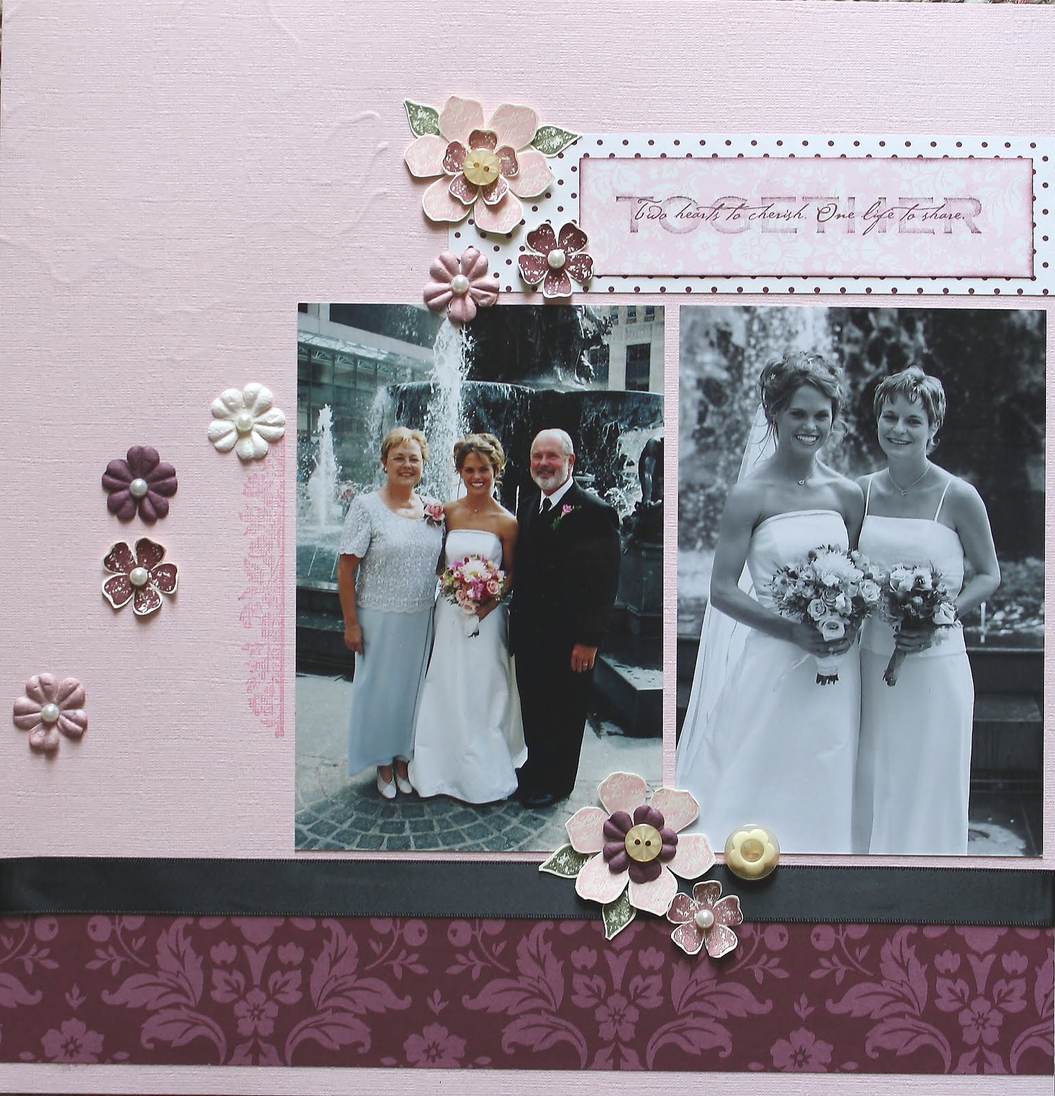
Finally, here is the layout from the actual cermony. It was a beautiful wedding. Can you believe how many pictures I fit on this layout? I am counting 11! That's not my record though. For the reception I actually fit something like 32 pictures on a 2-page spread... but they are just all fitted in like a puzzle with zero embellishments. I got so tired of doing wedding that that was my final hurrah!
For these two pages I used a Bravo Burgandy background and some coordinating wide grosgrain ribbon in a box bow on the left and a knot wrapped on the corner of a picture on the right. Added a couple of doves from the Two-Step bird punch too.
Thanks for stopping by again today! Today is my birthday so I plan to spend the day stamping, scrappin' and maybe even reading in the sunshine (if it warms up enough!). With the exception of a few loads on laundry, I'm not doing anything else (yeah right!)
Have a great day!
~Kristin

Wednesday, April 21, 2010

Tag, you're it!

This week's Diva Coffee Break Designs challenge is a sketch, and a fun one! Not too hard either. In fact, I took the easy way out. Chose some Designer Series Paper (Autumn Traditions), grabbed my large tag punch and pulled out the Pocket Silhouettes stamps. My focal point tag was easy to do, I just cut a narrow strip of Vanilla cardstock, used the tag corner punch for the top, added the Antique Brass jumbo eyelet with the Crop-a-Dile, sponged the edges and crimped the bottom. I found a piece of scrap twill tape to add to the top and it was done.

It is fun to mix and match the patterns of one collection of DSP in this way because you can flip each piece over to reveal a different pattern which could yield an entirely different look!

Go check out what some of the other Diva's came up with using this sketch, then be sure to play along yourself!

Thanks for visiting today. You never know, I just might have another scrapbook layout for you later this evening!
~Kristin

SUO Supplies
Stamps: Pocket Silhouettes
Paper: Soft Suede, Naturals Ivory, Autumn Traditions DSp
Accessories: Large tag punch, Antique Brass Jumbo Eyelets, Crop-a-Dile, tag corner punch, crimper, sponge dauber, twill tape

Tuesday, April 20, 2010

Beach Happiness

Another quick layout for you. For this one I used the retired Simply Scrappin' Kit called Happy Me! Gotta love those kits!
Thanks for stopping by! I'll be back tomorrow with a Diva challenge!
~Kristin

Monday, April 19, 2010

Where's Honey??

The first day of school for her brother started as a normal day, but when we took him to the school after lunch and drove home without him my daughter got so upset. At first I couldn't tell what was bothering her... until she started asking "Where's Honey?" (that was her way of saying Hunter at just under 2). I loved these different faces she made and her sitting under the tree waiting for the bus to drop her Honey off so just had to scrap it. These papers are from the Designer Series called Urban Oasis. Also on this page are a vellum Top Note, some Kiwi ribbon, and some chipboard. I'll list the rest of the supplies in the supply list at the end.
These pictures are not from the same day (or month even) so to help them look good side by side I used the same DSP and color scheme with the exception of some Melon Mambo in there to help highlight the picture of just her. I've noticed this weekend that I went without titles on a few occasions and am just fine with that. It eliminates the pressure of choosing the perfect words, plus helps indirectly state that this is just an ordinary day in the Moore household, not an extraordinary event.

So those are my Scrappin' Tips for today: Not enough pics for a 2-page spread? No worries, just subtly tie them together using a similar color scheme or even coordinating papers. Tip #2: It's OK to leave the title off if you want!

In case you hadn't noticed, this pages utilizes the Beautiful Wings and Big Bold Butterfly embosslit and die respectively. Hope you like it!
~Kristin

PS- The large circle on the top page was done by tracing a plate with pencil then cutting it with the craft knife. Easy! This is my second post for today so scroll down to see another layout!

SUO Supplies:
Paper: Urban Oasis DSP, Melon Mambo, vellum, Kiwi Kiss, Basic Gray, Baha Breeze
Accessories: Big Shot, Beautiful Wings embosslit, Big Bold Butterfly die, Top Note die, chipboard, Modern Label punch, Old Olive and Melon Mambo markers, Scallop Circles Die #2.

Tiny Tux, Taffeta & Tulle

Happy Sunny Monday stampers! I hope you had a fabulously fun and productive weekend like I did! The scrapbook retreat was top notch, as always and I got.... wait for it.... TWENTY ONE pages completed! Yep, that's right. I was on a roll. And even better is that I am totally pleased with most of them (nobody's perfect, right?!).

Over the next week or so I'll show them all to you. You'll notice that several of them are wedding related. My sister got married in 2003. Somehow in my scrapbooks I left off with this event and skipped all the way to November of 2004! YIKES! I just noticed this the morning of my retreat so I changed my strategy and decided to try to catch up that 15 month gap. Anyway, that's why I'm suddenly working on pics from 7 years ago.
My son was 3 at this time and was (if I may so say) the cutest stinkin' little kid in a tux I've ever seen (I may be biased a little). I just want to go back in time and squeeze him. Nowadays I mostly see him in baseball cleats, jeans with holes in the knees and dirt in various places... although he's still cute as ever I think.
He was promised a new BB gun by my mother-in-law if he walked down the aisle just like he was told. We all thought he might back out at the last minute due to nerves, but he sure did it just like a little man. It was one of the flower girls that had last minute nerves and couldn't make it.

Anyway, this is the first of the 12x12 scrapbook spreads you'll be seeing by me. For it and all 5 wedding layouts I did I used the Designer Series paper by Stampin' Up! called Parisian Summer (retired a while back). It was SO NICE to have a collection with such soft lovely and coordinating colors to make every page look lovely together, but all be different. You'll see what I mean!

Scrappin' Tip: To help with faster and easier coordinating pages for multiple layouts of the same event try using a pack of Designer Series paper! It will make your work MUCh easier, trust me!

Thanks for visiting. My next post will be a different topic completely (still scrapbooking though!).
~Kristin

PS- As always my supplies will vary. Mostly I used SU stuff, but in this case the sticker title (ancient something from my stash) as well as the epoxy flowers (also ancient!) and the silver stick-on pearls are all non-SU. The background paper is Basic Gray.

Friday, April 16, 2010

Scrapbook Retreat is TODAY!!

Frantically packing this morning for my annual weekend scrapbook retreat! I can't wait to see how much I can get done! Since I don't have a card to leave you with I'm posting this scrapbook page I completed the last time I had a scrapbook weekend. I hadn't posted this before because I think it needs something, but not sure what. I've considered a stitched border around the entire thing, but since I still haven't figured out my sewing machine I haven't done that yet. Just imagine it there and someday maybe I'll get to it.

Hope you have a great weekend- I plan to!
~Kristin

Thursday, April 15, 2010

Simply Sent

Here's another set of cards I made recently. These were very quick and easy because I used a Simply Sent kit that Stampin' Up! had sent me as a thank you quite a while ago. If you're not familiar with these kits I highly recommend checking them out! They come with everything you need to make a full set of cards with two different designs! This kit included all the precut papers, ribbons, brads, stamps, ink, envelopes and even Watercolor Crayons (in 3 colors) plus an aquapainter. They also have full sheets of glue dots and Stampin' Dimensionals. They are a great affordable way for someone new to stamping to give it a try, or for someone like me to get some cards done super quick!

For this set I did make two changes that are not part of the kit. Since I am making these as sets I wanted the sentiments to all be a little different so I used stamps from my own collection. Also, the card on the right has a textured piece (the Always Artichoke layer) that I ran through the Big Shot with my Finial Press Embossing folder. That's the beauty of these kits as well- you can adapt each one with anything you want from your own stash!

I may be back later with another example of a Simply Sent Card Kit, but in the mean time I want to give a shout out to my good friend Lisa Henke who made the fabulously talented and highly sought after group, the Dirty Dozen on Splitcoast!! Congrats Lisa, so proud of you!

If I don't make it back tomorrow it's because I'm off on a weekend-long scrapbook retreat I've been looking forward to since last year! Hopefully I'll be back with all kinds of completed, amazing scrapbook pages to share! Have a great weekend!
~Kristin
SUO Supplies
Simply Sent Kit Remembering You (retired)

Wednesday, April 14, 2010

Three Square

I'm not sure who came up with this design idea but this card came from another that I have saved in my "Cards to CASE later" file! Since I've been busy coming up with quick card sets for the Mom's Club Craft Bazaar or whatever it is called, I have been copying some favorites that I've been meaning to try for a long time.

This one was fun and not too hard, and has great results I think. The leaves are from the Little Leaves Sizzlit which I cut out three for each card in Vanilla paper. Glue them onto whatever color cardstock you want (I've used Marigold Morning, Brilliant Blue and Old Olive here) then punch out with the 1 1/4" square punch. Layer them on a slightly bigger square and glue them on a neutral cardbase. That's it! If you have a Xyron this is the perfect time to put it to use, otherwise I recommend SU's Two-Way Glue pen for the leaves.

In this set I have a Happy Birthday, Congratulations, Thinking of You and Thank You. Each of the sentiments is from an old set called Warmest Regards, an old hostess set I believe. See, I told you it's OK to hang onto those retired stamps and inks and papers!

So thanks for stopping by. I hope you have some sunshine in your life today!
~Kristin

SUO Supplies
Stamps: Warmest Regards
Colors: Sahara Sand, Very Vanilla, Marigold Morning (Retired In Color), Brilliant Blue, Old Olive
Accessories: Big Shot, Little Leaves Sizzlit, 1 1/4" square punch, 1 1/2" square punch

{friend to friend} A Diva Challenge

Today is a Diva Coffee Break Designs Day- and we are offering up a fabulous color challenge! Cameo Coral, So Saffron and Chocolate Chip! When I saw this color combo in our lineup a few weeks ago I couldn't wait to try it! I have several other ideas in mind but don't have time to put them to paper right now.

I used Cameo Coral as my card base since it will no longer be with us as of July 1. Paying tribute ahead of time I guess. I've always been a supporter of Cameo when it gets dissed by other stampers! Circle Circus is the stamp set of choice today. Pretty straight-forward, don't ya think?!

Stampin' Tip: Need a boost to get your card making started? Find a card with a layout you love, switch out the colors, change up the stamps and voila! That's what I did here. Here is the card layout that I copied for this card.

Hope you have a great day, and please go check out the Diva blog for more inspiration so you can play along too!
~Kristin

SUO Supplies
Stamps: Circle Circus, Teeny Tiny Wishes
Colors: Cameo Coral, So Saffron, Chocolate Chip
Accessories: Wide Chocolate Grosgrain, Scallop circle punch, 1 1/4" circle punch, 1 3/8" circle punch, Designer Circle Brads

Tuesday, April 13, 2010

Fifth Avenue Gift Set

Good morning! This week I'm working on making some card sets to sell at a Mom's group Craft Bazaar that my sister is involved in. This set is inspired by a card by Jackie Wright that I saved to my "Cards to CASE" file back in October 2009. My birthday card below is nearly a duplicate of hers and the others just kind of fell into place.

This is perfect timing because this stamp set, Fifth Avenue Floral, is 20% off this month, along with a few others. Click HERE to find promotion details! If you'd like to see other blog posts using this stamp set click HERE. Greenhouse Garden is another beautiful set that is currently offered as part of this promotion. Click HERE to see blog posts with Greenhouse Garden.

For each card I stamped the flower multiple times in vanilla ink then embossed with vanilla embossing powder. Stampin' Tip: To add a bit of dimension I then colored in each image with the Versamarker! Yep, that's one great way to use that Versamarker. For a few of them I also used markers to add a tiny hint of color to the centers. Finished them off with some dotted grosgrain ribbon in either Rich Razzleberry or Crushed Curry. Aren't they just sunny and happy? Here is a closeup look of each one:


Thanks for stopping by today! I've got a few other sets I've done as well so I'll be showing those over the next few days. Be sure to stop by tomorrow for a FABULOUS Diva Coffee Break Designs color challenge! You won't want to miss it!
~Kristin
SUO Supplies
Stamps: Fifth Avenue Floral, Warmest Regards (retired sentiment set)
Paper: Kraft (will soon be called Crumb Cake and have ink to match!!)
Accessories: Vanilla Embossing Powder, Crushed Curry & Rich Razzleberry dotted grosgrain & matching markers, Versamarker, Chocolate Chip and Mellow Moss ink

Friday, April 9, 2010

Welcome Baby!

Hello, and TGIF! Today I'm using the soft and springy color combination from the Color Throwdown (CTD87) to use pink, gray and soft olive. I think this counts! I've used two shades of pink, two shades of gray and I never pass up the opportunity to use Kiwi Kiss!

The sketch is from Mojo Monday (MOJO133)- isn't it great?!! Did you notice my Going Gray piece that is crimped? I think it unintentionally ended up being reminiscent of a picket fence.

This is my first use of the stamp set called Good Neighbors which was one of the last FREE sets I earned during Sale-a-Bration. First I stamped the house and trees but decided it was a little too bare so then I cut a template for a sidewalk, used temporary adhesive to put it in place, another piece of scrap paper over the house and sponged on some Kiwi grass. What do you think? It is supposed have a welcoming feel for the arrival of a new baby.

So do you think my "Welcome Baby" is bold enough or should I have stamped it in white? It is actually in Rose Red which is more obvious in person.

Well, gotta run. Off to watch the Fort Wayne Komets play tonight! Have a great weekend and I'll see you back here on Monday (hopefully!)
~Kristin

SUO Supplies
Stamps: Good Neighbors, Short & Sweet
Colors: Basic Gray, Going Gray, Pink Pirouette, Kiwi Kiss, Rose Red
Accessories: Satin Kiwi ribbon, Pinking Hearts border punch, Heart to Heart punch, crimper

Thursday, April 8, 2010

A Color Challenge & Color Facelift by SU!

Good Thursday morning! Has it really been 8 days since I posted last?! My excuse is... ah, the dog ate my homework! That's it and I'm sticking to it. Actually, you know- it's spring and I've been on walks and working outside and in general getting side tracked with other stuff. I honestly did not stamp once during that 8 days! Yikes!

Well I hope it was worth the wait (plus I left you with like 7 cards on one post so that should count for something right?!)! I made this with Tuesday's color challenge from Splitcoast in mind... to use Soft Suede, Certainly Celery and Tempting Turquoise- Yummy!! I just adore this color combo. I borrowed the idea of layers of "ruffles" at the bottom from a video posted to the Stampin' Up! website for demonstrators this week. Speaking of adorable colors and Stampin' Up! have you heard the GREAT NEWS?!?

I am thrilled to be the one to tell you if you haven't! Stampin' Up! announced on Tuesday a fabulous Color Renovation that is about to take place beginning with the new 2010-2011 Idea Book & Catalog which premiers on July 1! Take a look at the four new Color Collections: (click on this picture to view a larger version)
A few things you'll notice upon closer inspection:
  • There are FIVE new colors (can you find them??)
  • TEN of our favorite In Colors are returning! Yahoo!
  • Did you see "Crumb Cake" listed in the neutrals?? That, my friends, is our well-loved Kraft
  • All of these colors (YES ALL!) will be available in not only cardstock and ink but also marker, Watercolor Crayon, Stampin' Pastel and more!

Other great things I want to point out:

  • There will also be 5 new In Colors introduced in this new Idea Book & Catalog which will be available for TWO years instead of one! What a great improvement!
  • This means that in the 2011-2012 Idea Book & Catalog when 5 more In Colors are introduced there will be a total of TEN!
  • Bundled kits will be available to update your cardstock, ink, marker, Watercolor Crayon and Stampin' Pastels collections without having to purchase the colors you already have!!
  • A redesigned Color Coach is coming that you will just drool over! I can't wait for you to see it- heck I can't wait for ME to see it in person!

So there you have it! Let's bid a fond farewell to those retiring colors, stock up on the cardstock if you must, then sit back and gaze lovingly at these new Color Collections with us. Three cheers to Stampin' Up! for continually leading the stamping community with the hottest, most up-to-date colors out there!

I'd love to hear your thoughts on these great new changes we have to look forward to!

Thanks for stopping by,

~Kristin